
Goal Insights
With Goal Insights you can examine how effectively employees or teams use their time. You can see how much working time can be billed, which value groups are being worked on and where there is potential for improvement
With Goal Insights (German: Ziel-Insights) you analyze your employees’ goal achievement in terms of time bookings and value contributions.
The view shows how much time was actually worked in the selected period, how much of it was billable and how the working time is distributed across value groups.
The aim is to provide transparency about the performance, efficiency and value creation of individual employees or entire teams.
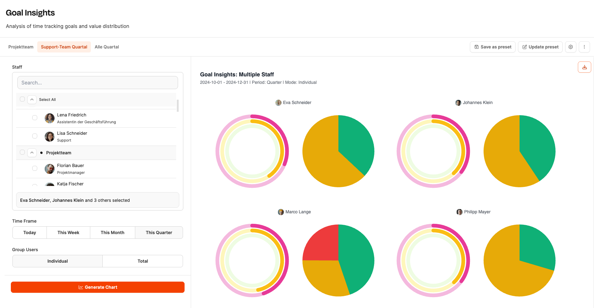
Page layout
Left column: Selection of employees, time period and display mode (individually or overall)
Right column: Two charts per person or team
- Goal achievement (donut chart)
- Value group distribution (pie chart)
Selection (left column)
Staff: Choose individual employees, entire teams or all people. Use Select All to activate all available employees.
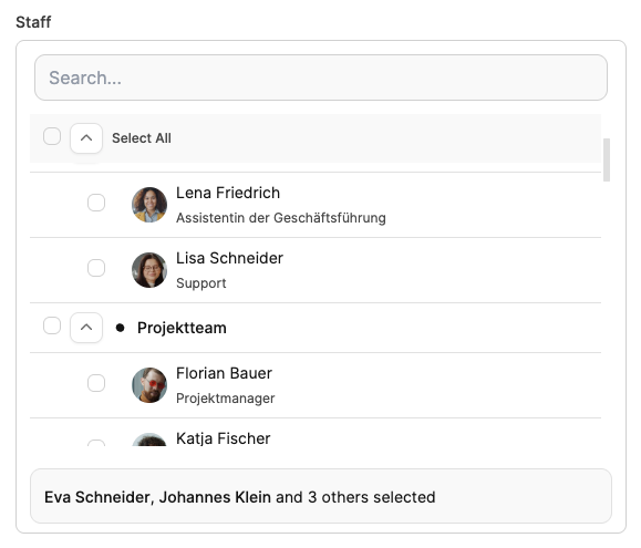
Time Frame: Define the period to analyze:

- Today
- This Week
- This Month
- This Quarter
Group Users:

- Individual – shows charts for each person separately.
- Total – sums the data of all selected people into a single overall view.
Charts (right column)
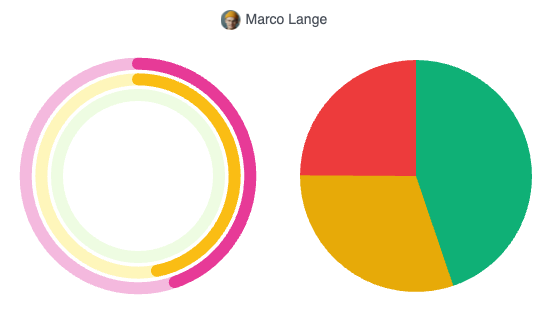
Each analysis consists of two charts displayed side by side:
Goal achievement (donut chart)
The Leadtime-typical triple donut chart shows three levels:
- Outer ring (pink): Attendance time in relation to the contractually agreed working hours.
- Middle ring (yellow): Booked working time – i.e. the hours actually recorded.
- Inner ring (green): Billable time in relation to the target working hours – shows the degree of goal achievement.
This lets you see at a glance how much time was worked, booked and used billably.
Value group distribution (pie chart)
This chart shows how the booked hours (yellow ring) are distributed across the different value groups:
| Group | Color | Description |
|---|---|---|
| A – Direct Value Adding | Green | Directly value-adding activities (billable hours, customer work) |
| B – Indirect Value Adding | Yellow | Indirectly value-adding activities (e.g. internal projects, product development) |
| C – Non-Value Adding | Red | Non-value-adding activities (e.g. administration, accounting) |
| D – Waste | Black | Waste, unproductive time (e.g. idle time, waiting times) |
Tip: When you hover over a segment, its share is shown in hours and percent.
See Value groups
Typical questions & settings
| Question | Period | Group Users | Goal |
|---|---|---|---|
| How many billable hours did a person achieve this week? | This Week | Individual | Track personal goal achievement |
| How much billable time did the entire team achieve in the quarter? | This Quarter | Total | Overview of team performance |
| In which value groups is the most time spent? | This Month | Individual | Analyze the work structure |
| How large is the share of direct value creation compared to internal activities? | This Quarter | Total | Evaluate efficiency and distribution |
The saved charts can be displayed on the Dashboard.