
Project Insights
Analyzes project times, tasks and user activities in Leadtime. Display as a time series or overall view with flexible filters and diagrams.
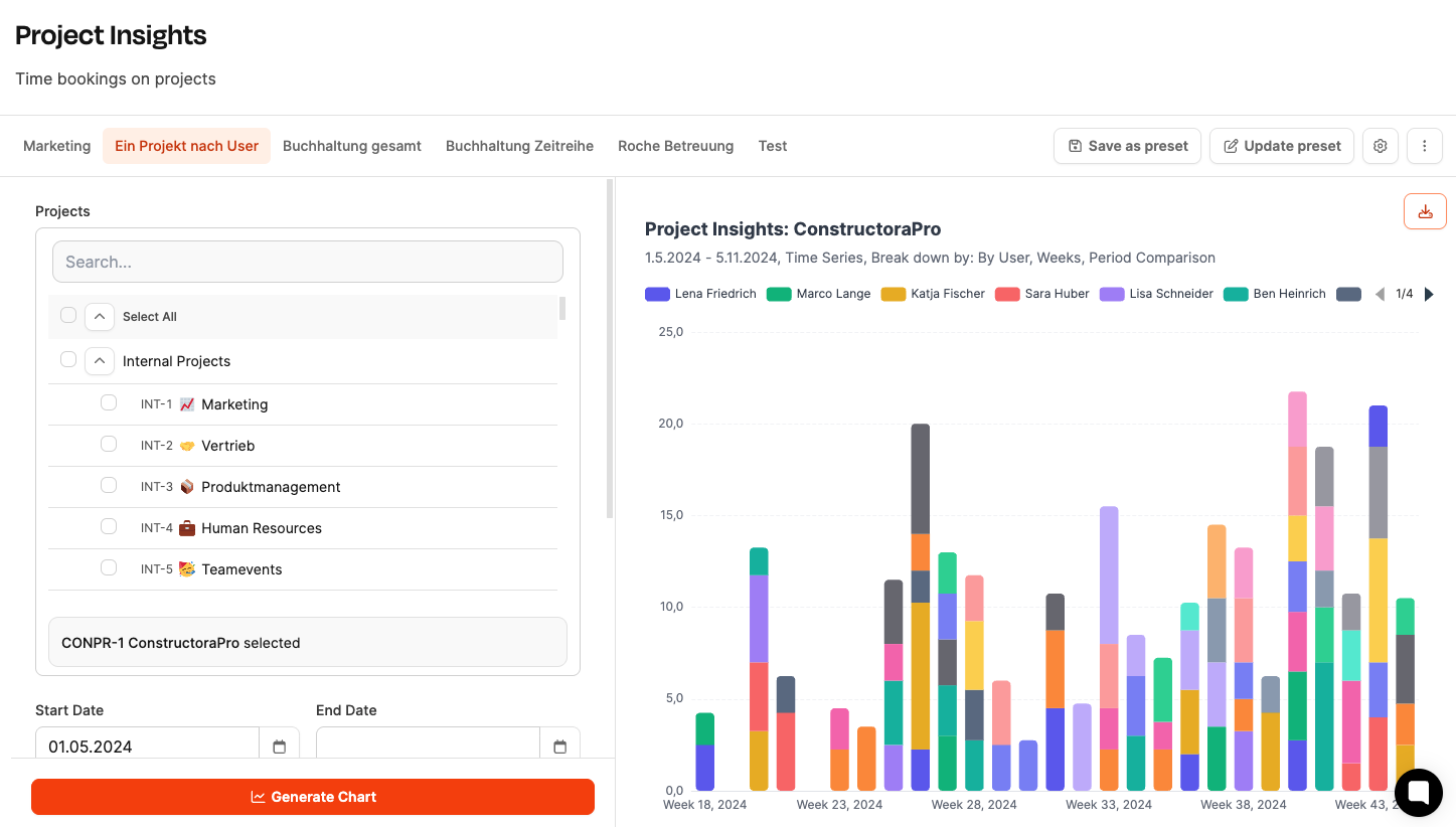
The Project Insights area in Leadtime enables detailed analysis of working times and activities across projects. It helps you make developments over time visible, spot bottlenecks and make well-founded decisions about resources and priorities. Here companies can track how many hours are spent on projects, tasks or users – across days, weeks or months.
See Projects
Application and benefits
With Project Insights you can give well-founded answers to operational and strategic questions – such as:
- How is the effort in the team distributed over time?
- Which project types tie up the most resources?
- Where do the hours consumed rise or fall significantly?
- Which employees work the hardest in certain phases?
These insights enable predictive management of projects and resources.
Structure
The page is divided into two areas:
- Left column: Configuration of the evaluation (filter, period, display)
- Right column: Visualization of the results in different chart types
Configuration options
Project selection
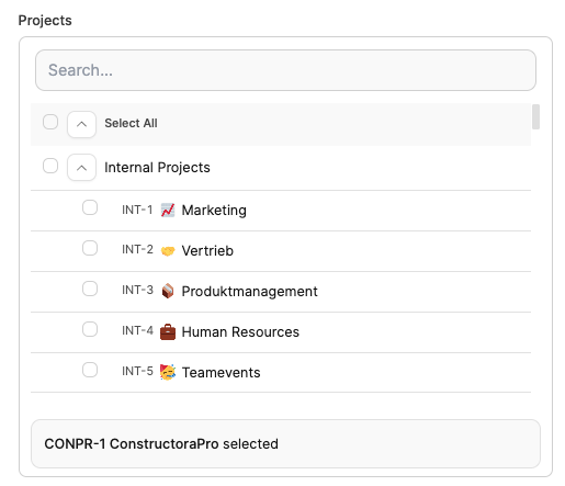
- Selection of one or more projects
- Combination of internal and external projects
- Optional: search field for quick filtering
Time period

- Start date: sets the beginning of the analysis
- End date: defines the end (open = current date)
Model

- Time series: shows the progression over time (weeks or months) – ideal for trend analyses
- Total: aggregated view of all hours – ideal for distribution analyses
Periods

- Weeks: fine resolution for sprint or short-term evaluations
- Months: clear presentation of longer-term developments
Breakdown by

- Project: shows the comparison of several projects
- Task: shows the effort per task
- Task type: grouped e.g. by feature, bug, idea or management
- User: compares individual time shares within the team
- None: shows the overall progression without any subdivision
Show data as

- Groups: shows separate bars per unit (e.g. project or user)
- Stack: shows totaled bars with a color breakdown
Create diagram
Once you have selected the parameters, the “Create diagram” button generates the corresponding visualization.
Evaluations and diagrams
Chart types
- Bar chart: standard display for time progressions
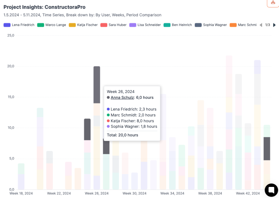
- Stacked bars: shows totals with an internal breakdown
- Pie chart: overall distribution across projects or categories
- Trend line: cumulative development over the period
Tooltip
Hovering over a bar with the mouse displays details such as hours, users and categories.
Export & presets
- Excel export: download data in table format
- Save presets: store frequent evaluations
- Update presets: adjust existing evaluations
The saved diagrams can be shown on the Dashboard.
Examples
| Question | Setting options |
|---|---|
| How are 500 hours on project XY distributed over the last few weeks? | - Select project - Set start date - Model: time series - Period: weeks or months - Breakdown by none / task type / tasks / user |
| How are 5,000 hours from internal projects distributed across individual teams? | - Select projects - Set start date - Model: total - Breakdown by none / task type / tasks / user |
| How many hours were booked per month on projects X, Y and Z? | - Select projects - Set start date - Model: time series - Period: weeks or months - Breakdown by none / task type / tasks / user - Show data: By group |
| How many hours were spent in total on projects X, Y and Z? | - Select projects - Set start date - Model: time series - Period: weeks or months - Breakdown by none / task type / tasks / user - Show data: By stack |